In response to feedback from our post last week, we present the latest version of First Draft, redesign courtesy of the lovely and talented Scout.
A.
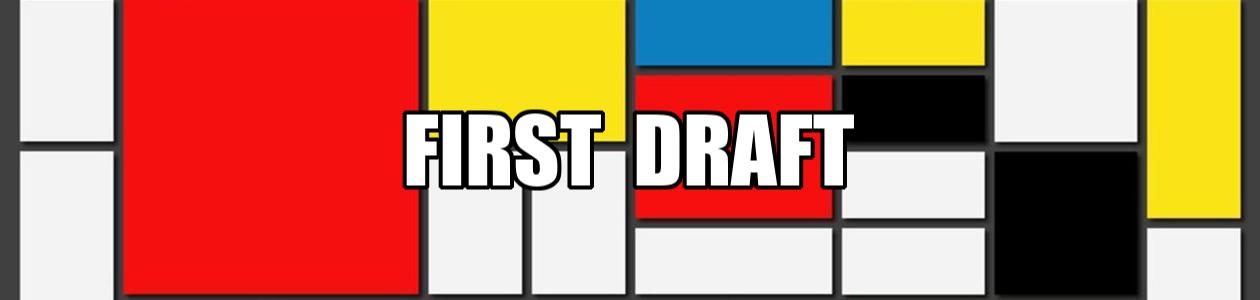
In response to feedback from our post last week, we present the latest version of First Draft, redesign courtesy of the lovely and talented Scout.
A.
Comments are closed.
Construction FYI: The new design is working in every browser but IE and we are working on that
Great new look! I love the design but I have one quibble. The ‘First Draft’ seems to float a bit against the pure white background. I don’t know if it’s because my eyes are tired or a font that size on a white background is just too bold or what. Does anyone else think the top banner is too bold? Maybe you can add another subtle element to the white background in the top banner like a lattice or some graph paper or topo lines from Wisconsin or something. Or maybe I should take a nap and look tomorrow. To get an idea what I’m talking about take a look at this graphic from the Tom Allen for Senate campaign (Maine) via MyLeftNutmeg.
http://www.myleftnutmeg.com/showDiary.do?diaryId=7112
Notice the very faint lines, maps, and airplane elements underneath the text? I think that kind of underlay really solidifies text on a large white background.
Other than my tired eyes I love it. I love the typewriter element and colors and it seems a lot more welcoming and homey. I like the left column elements a lot too – the photos and highlighted features are frackin’ cool.
On my computer (Mac OS 10.3.9 using Safari 1.3.2) something near the end of the process is taking a L O N G time to load.
The new center column seems narrow to me (but I suppose it would be wider if I got a bigger monitor, eh?)
In the past (on other sites) the problematic loading item has been some old ad (IIRC).
It’s just beautiful.
Wow.
Oooooh.
Ahhhhhh.
Deeply Number One.
This time, the site loaded zippy quick. No probs.
MUCH easier on the eyes, thanks, Scout!
You might consider losing some of the red and/or black underlines for all the article titles, etc., and rely more on white space. There’s a whole lot of lines on that thar page. 🙂
Cool new look! Great job (and I love the pics of Willie B!)
squirm…thanks. I hadn’t meant for the line under titles. They’re now gone
Don’t take this wrong but I liked the other look better. It was easier for me to read. This format is too “busy” for me.
Sorry.
MUCH nicer! I missed the original feedback post but I would have said that I found the “pink” design much harder to read easily. For some weird reason reading your words in that different setting even made them sound different in my head! Crazy I know.
One question and a belated suggestion: Is the header image with the typewriter meant to stretch across the whole screen? On my widescreen 17″ monitor (resolution 1440X900 with Firefox), it stops a couple inches short of each edge.
A “next 15” or something link at the bottom of each page that will load the next page of posts would be great. If I’m looking back for a post, having to negotiate the archives is a nightmare and they don’t correspond to the loaded page for me.
Keep up the good work!
Of course the thing I love the most is Holden sitting on the hood of my car,
My nap fixed everything in my brain. Beautiful job Scout!
sweet.
Excellent work, Scout; congratulations. Your energy and talents continue to amaze.
And Willie B rules!
Peace, V.
I like it! ‘Course, I liked the old version, too. I’m easy–it’s all about the words for me.
I do like the typewriter–that’s a very nice touch.
Hey all!
I haven’t been around much as of late, and haven’t been commenting when I am, but I haven’t disappeared. I’m sure you were all just sick with grief wondering where I was. Anyway, I missed the original feedback post as well (went back to check though). But holy crap was I pleasantly surprised to see the shiney newness this morning! I love the new look, especially the matching shoes. Were they on sale?
FD is my first stop in the morning, too. I also feel, as some said in the original post, that the sense of community here is a tremendous draw, second only to the high quality of writing and insight and just plain awesomeness of the FD gang. A lot of the other sites are just too damn big to navigate or really digest.
Oh, and I love the kitties, the ferrets, the ponies, etc. The typewriter is perfect. I have always loved “writing is only real on the first draft” and I’m glad to see it up in the header.
One final note, in case you’re wondering who the hell I am…I’ve changed my username. I’ve been sick of the old one for a while now, so I decided now was a good time to make the switch. New site design, new username. 🙂
Keep rockin’, all!
– The Commenter Formerly Known as WitchWay11
Hey, I thought you turned the comment verification off? What happened? Too much Chinese porno spam?
Wha happened- yesterday no mud purple- it got me back today..and, back to same old same old…glitch or backtrack?
sweet
much nicer! more organized and professional appearance. (people still use IE?)
Sorry, I don’t like it. Several steps backward in Web design, and the new header really sucks. I also disagree with your tagline and always have (shame on you!). The pink is silly, too. Typographically, you have a disaster going on here. Ugh.
FYI, from the distant shores of IE6 on Win XP, things look hunky dory. Must have been a busy night. Thanks again, Scout!
Major improvement! Much more readable IMHO. And I agree with the tagline; after that it’s editing.
Now you gone and done it! Very nice. Me likey!
Love, love, love this! I can now read the site without squinting or changing font size.Much easier on the eyes.
Major thumbs up! Definitely much preferred to the previous version.
test
Scout, it’s gorgeous!
And Dusty59 can bite me.
It looks great! And a link to me! What an improvement!
OK, so, I see Athenae and Scout in the pic, and I’m assuming the pony is Holden… but where the hell is Tena? Not in Athenae’s purse, I hope?
What a shock! Like I had dropped into a page from the past. I especially like having “writing is only real on the first draft” back up there. Although the previous header had some nice swoopy stuff, too. Heck, I come to read what you guys write, not look at the scenery. Redecorate whenever you want.
Great site!f5dc5c4a8da7b7222b4aa252ccc1d220